
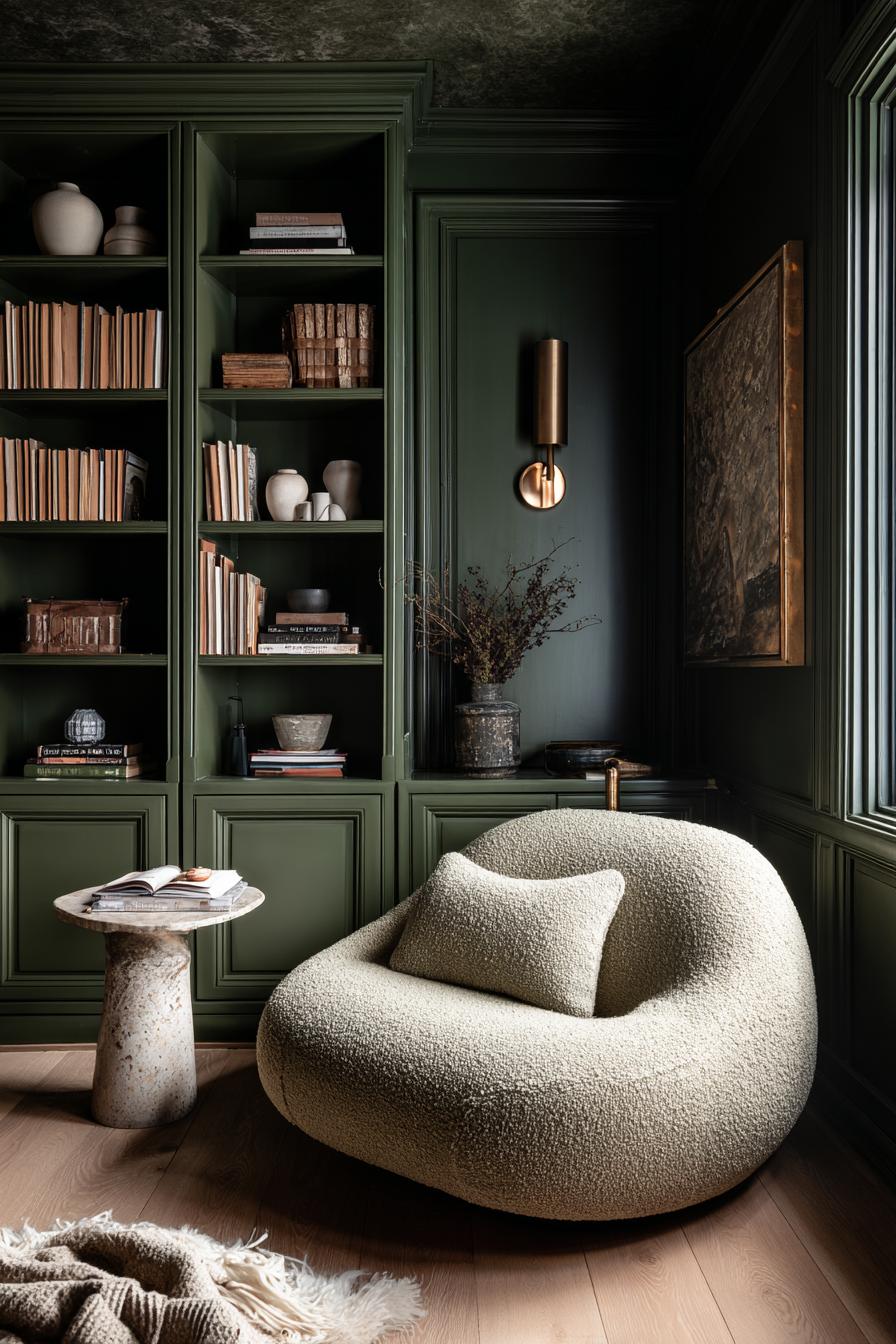
Of all the color families I work with, green is the one clients are most afraid to commit to — and the one they’re almost always glad they did.
Green paint has a way of grounding a room that’s hard to replicate with any other color. It reads as both warm and calm, which is a rare combination. The challenge is that green is one of the most light-sensitive colors in the spectrum. A shade that looks sophisticated in a north-facing room can turn murky or cold in a south-facing one. And a green that photographs beautifully online can show up as something completely different on your walls.
The picks in this guide are ones I keep coming back to because they hold up — in different light conditions, against natural materials, and across a range of design styles from organic modern to Japandi to relaxed Mediterranean. The key in every case is warm, muted undertones. Avoid anything that reads too cool, too yellow, or too saturated on the chip. Those are the greens that disappoint.

Best Green Paint Colors for Accent Walls
The accent walls that work best aren’t the ones that shout for attention — they’re the ones that make you feel like the room was always supposed to look this way. The goal is a sense of depth and intention, not a random stripe of color behind a sofa.
For green specifically, I look for shades that create contrast without clashing. The wall should feel like it anchors the room, not competes with it. That means leaning into muted, complex undertones rather than anything clean or primary.
1. Soft Sage Green Paint Colors
Soft sage greens are timeless because they feel calming, organic, and easy to layer with warm neutrals.
Perfect for:
- Bedrooms
- Living rooms
- Entryways
- Offices

Sherwin-Williams: Evergreen Fog SW 9130

Evergreen Fog is one of those colors that earned its popularity the right way — through performance. It’s a muted sage with just enough gray to keep it from feeling sweet or pastel, and it behaves well in almost any lighting condition, which is not something you can say about most greens.
In practice, it works beautifully with the material palette I return to most often: white oak, cream upholstery, warm whites, brass lighting, and linen textures. If a client is nervous about committing to green, this is usually where I start. It’s elevated without being demanding.
Behr: Breezeway MQ3-21

Breezeway is a slightly airier sage-green that leans soft and coastal without becoming minty.
It works especially well in:
- Organic modern homes
- Scandinavian spaces
- Neutral interiors needing subtle color
Pair it with warm woods and textured fabrics to keep it feeling elevated.
Benjamin Moore: October Mist 1495

October Mist is a color I’ve specified more times than I can count, and it consistently surprises clients in the best way. On the chip it can look almost neutral — which is exactly the point. That soft silvery undertone is what makes it behave so well across different lighting conditions and room types.
It’s one of the few greens I feel confident recommending for open-concept spaces, where paint has to read well from multiple angles and light sources throughout the day. Works just as well in kitchens, bedrooms, and hallways — it’s genuinely versatile in a way that most “versatile” colors aren’t.
2. Olive Green Paint Colors
Olive greens add richness and warmth while still feeling earthy and grounded.
These are ideal for:
- Dining rooms
- Built-ins
- Fireplace walls
- Offices

Sherwin-Williams: Ripe Olive SW 6209

Ripe Olive is the green I reach for when someone wants mood without drama. It reads deep and warm — more like a natural material than a paint color, which is exactly what works so well in organic modern interiors.
The yellow-olive base keeps it from feeling cold or forest-like. Paired with walnut, travertine, vintage brass, and cream, it creates that layered, collected feeling that takes a room from nice to considered. I’ve used it on fireplace surrounds, built-ins, and accent walls, and it works in all three contexts.
Behr: Back To Nature S340-4

Back To Nature is a lighter olive-inspired green that feels earthy and approachable.
It’s ideal if you want olive tones without committing to a darker moody room.
This shade works beautifully for:
- Accent walls
- Kitchens
- Mudrooms
- Entryways
Benjamin Moore: Gloucester Sage HC-100

Gloucester Sage is a rich muted olive-green with historical depth.
It feels:
- Collected
- Sophisticated
- Slightly European
- Timeless
Perfect for homes that lean warm and layered rather than ultra modern.
3. Deep Forest Green Paint Colors

Deep forest greens create dramatic contrast and instantly elevate a room.
Perfect for:
- Dining rooms
- Libraries
- Moody bedrooms
- Powder bathrooms

Sherwin-Williams: Pewter Green SW 6208

Pewter Green is the dark green I recommend when someone is ready to go moody but isn’t quite sure they can live with a true deep color. What makes it work is how much it shifts — depending on the time of day and the direction your windows face, it can read as deep green, smoky green-gray, or something close to a warm olive. That movement is actually what keeps it interesting.
It’s forgiving in a way that most dark colors aren’t, which is why I consider it the best entry point if you’re new to painting with deep shades. It adds serious richness without cornering you into a room that feels heavy.
Behr: Dark Everglade HDC-CL-21A

Dark Everglade is a rich dramatic forest green with earthy undertones.
It works beautifully for:
- Cabinetry
- Accent walls
- Moody dining rooms
- Color drenching
This color pairs exceptionally well with warm brass lighting.
Benjamin Moore: Essex Green HC-188

Essex Green is one of those colors with real architectural presence — the kind that looks like it belongs in a historic townhouse or a beautifully appointed library. It’s deeply saturated but never garish, which is a difficult balance to get right at this depth.
I’ve used it in traditional-modern homes where the goal is warmth and longevity over trend, and it always delivers. If you want a dark green that won’t feel dated in five years, Essex Green is the answer. It’s dramatic the way good design is dramatic — intentional, not loud.
Best Green Paint Colors for Moody Rooms
The term “moody” gets overused, but when it comes to green paint, it describes something specific: a room that feels enveloping rather than open, rich rather than stark. It’s less about how dark the color is and more about how it interacts with light and materials around it.
The greens in this section are ones that create atmosphere — the kind of room that feels different at noon than it does at 8pm, and better for it. To get there, you need the right shade and the right material context. Warm woods, soft textiles, layered lighting. The paint is only part of the equation.
4. Smoky Green-Gray Paint Colors
These muted green-grays create softness while still adding depth.
Ideal for:
- Bedrooms
- Hallways
- Bathrooms
- Relaxing spaces

Sherwin-Williams: Retreat SW 6207

Retreat is one of the most underrated moody green paints.
It combines:
- Green
- Gray
- Smoky undertones
for a relaxed, sophisticated finish.
This color looks stunning with:
- Warm white trim
- Cream bedding
- Walnut furniture
- Soft ambient lighting
Behr: North Woods N410-7

North Woods is darker and moodier while still maintaining warmth.
It works especially well in:
- Media rooms
- Offices
- Dining rooms
This color creates dramatic contrast without feeling blackened.
Benjamin Moore: Carolina Gull HC-144

Carolina Gull is one of the richest smoky green-grays available.
It shifts beautifully throughout the day and feels incredibly architectural.
This is a designer favorite for moody interiors.
5. Deep Emerald Green Paint Colors
Emerald greens create bold luxury and dramatic depth.
Best used in:
- Powder baths
- Dining rooms
- Bars
- Statement spaces

Sherwin-Williams: Hunt Club SW 6468

Hunt Club is a rich emerald green with classic depth and saturation.
It creates a dramatic statement while still feeling warm and grounded.
Perfect with:
- Brass fixtures
- Marble
- Dark wood
- Vintage-inspired lighting
Behr: Royal Orchard PPU11-1

Royal Orchard is a jewel-toned emerald that feels bold but elegant.
This works best in smaller spaces where you can fully embrace the mood.
Benjamin Moore: Salamander 2050-10

Salamander has a reputation in the design world for good reason. It’s an ultra-dark green-black that looks almost black in low light and reveals its green depth in brighter conditions — that shift is part of what makes it so compelling to work with.
I’ve seen it used beautifully on built-ins, cabinetry, and in powder baths where the small scale lets you go fully immersive without it feeling oppressive. For color drenching — walls, ceiling, trim, and all — it creates one of the most dramatic and elevated results I’ve seen from any single paint color. Not for the timid, but absolutely worth it in the right space.
Best Green Paint Colors for Color Drenching
Color drenching is one of those techniques that sounds extreme until you see it done well — and then it becomes immediately obvious why designers keep returning to it. The concept is simple: walls, trim, ceiling, and doors all in the same color. What it does to a room is not simple at all.
By eliminating the contrast between surfaces, the eye stops reading the architecture and starts experiencing the room as a whole. It becomes enveloping in the best way — more like a mood than a room. Green is particularly well-suited to this technique because its natural, organic quality makes the effect feel intentional rather than theatrical.

6. Best Sage Greens for Color Drenching
Sherwin-Williams: Clary Sage SW 6178

A softer sage that works beautifully throughout entire rooms without becoming overwhelming.
Perfect for:
- Bedrooms
- Offices
- Nurseries
Behr: Laurel Tree S390-5

Warm, earthy, and muted with enough depth to feel sophisticated across all surfaces.
Benjamin Moore: Saybrook Sage HC-114

A timeless sage-green that feels cozy, layered, and classic.
7. Best Dark Greens for Color Drenching

Sherwin-Williams: Jasper SW 6216

Jasper creates dramatic cocoon-like interiors with incredible richness.
Especially stunning in dining rooms and offices.
Behr: Black Bamboo N380-7
An earthy near-black green that creates dramatic depth while still feeling organic.

Benjamin Moore: Vintage Vogue 462

Vintage Vogue is one of the best dark olive greens for full-room drenching.
It feels:
- Sophisticated
- Warm
- Moody
- Editorial
without becoming overwhelming.
Tips for Using Green Paint Successfully
Always Sample First
Green is the color I’m most insistent about sampling before committing. It shifts more dramatically than almost any other hue depending on your natural light, the direction your windows face, your flooring, and even the colors in adjacent rooms.
When you get your sample pot, paint a large swatch — at least 12 by 12 inches — directly on the wall, not on a piece of paper or cardboard you move around. Live with it for a few days and look at it at different times: morning light, afternoon sun, and under your actual evening lighting. That’s when you’ll see what you’re really getting.
Pair Green With Warm Materials
Green looks best layered with:
- White oak
- Walnut
- Travertine
- Brass
- Linen
- Cream textiles
- Limewash textures

These materials soften the paint and keep the room feeling elevated.
Don’t Leave the Ceiling White in Moody Rooms
Leaving the ceiling bright white in a moody green room is one of the most common mistakes I see — and one of the easiest to avoid. A stark white ceiling creates a hard line at the top of the room that cuts the atmosphere in half.
In a powder bath or dining room especially, painting the ceiling the same color as the walls (or a shade lighter in the same family) transforms the space from “painted room” to “designed room.” It signals that the color was intentional rather than a decision you weren’t quite sure about. Once you see a fully painted ceiling done right, the white ceiling alternative never looks the same.

Final Thoughts
If there’s one thing I’ve learned from working with green paint across dozens of projects, it’s that the color itself is only half the decision. The other half is everything around it — the materials, the lighting, the ceiling treatment, the trim color. Green rewards thoughtfulness more than almost any other color family.
Whether you go soft sage on a single accent wall or commit to a fully color-drenched room in a deep forest shade, the principle is the same: choose a green with warm, muted undertones, sample it properly on your actual walls, and let the materials do the rest. Travertine, white oak, brass, linen — these are the things that make a green room feel elevated rather than just green.
Get those elements right, and the color almost takes care of itself.

Whether you prefer:
- Soft sage accent walls
- Rich olive dining rooms
- Dramatic emerald powder baths
- Fully color-drenched interiors
the right green can completely transform how a space feels.
The key is choosing greens with warm, livable undertones that complement natural materials and layered textures rather than overpowering them.

