
Moody paint is having a moment—but not in the “paint one wall navy and call it a day” way. The modern version of moody is richer, more nuanced, and way more design-forward: deep earth tones, inky greens, softened charcoals, and browns that read like espresso instead of builder beige. Done right, moody color makes a space feel intentional, elevated, and a little cinematic.
And the best part? Moody paint doesn’t require a full renovation. A powder bath, a single accent wall, or a color-drenched room (walls + trim + sometimes ceiling) can completely change how your home feels with just a few gallons of paint.
Below are our favorite moody paint directions—plus how to choose the right one based on lighting, undertones, and the vibe you’re after.
Why Moody Paint Works So Well in Small Spaces
Moody colors thrive in spaces where you’re not trying to make things feel “open concept” or bright and airy. Powder baths, dens, bedrooms, and dining rooms are perfect because they’re meant to feel enveloping. Instead of fighting shadows, moody paint makes shadows look expensive.
Deep colors also create contrast in a way that instantly reads custom. Even if your vanity is simple, your mirror is basic, or your lighting is builder-grade—moody paint can make the whole room look curated.

1) Moody Paint Colors That Are Perfect for a Powder Bath
Powder rooms are the easiest place to be bold because you’re only in there for minutes at a time. This is where you can choose drama without worrying about living in it all day.
Inky Blue-Black (for a luxe, boutique feel)
If you want your powder bath to feel like a high-end restaurant bathroom (in the best way), go for an inky blue-black. These shades look incredible with brass, un-lacquered brass, or polished nickel.

🎨 Inky Blue-Black: Bold + Boutique
| Brand | Swatch |
|---|---|
| Sherwin-Williams | Black Fox SW 7020 |
| Benjamin Moore | Hale Navy HC-154 |
| Farrow & Ball | Railings No. 31 |

Pair with:
- Brass faucet + warm white marble or limestone-look counters
- A vintage-inspired sconce with a soft glow
- A moody framed art piece or a textured wallpaper on the ceiling
Why it works: These deep blue-blacks read almost black in low light but have richness that prevents them from feeling flat or harsh.
Pro tip: Choose a blue-black instead of a pure black—blue undertones keep it from looking flat.

Deep Forest Green (for organic-modern richness)
A deep green gives you “heritage home” depth but can still feel modern when paired with clean lines. It also plays beautifully with natural textures like white oak, rattan, and stone.

🌲 Deep Forest Green: Nature Meets Sophistication
| Brand | Swatch |
|---|---|
| Sherwin-Williams | Rosemary SW 6187 |
| Benjamin Moore | Hunter Green 2041-10 |
| Farrow & Ball | Studio Green No. 93 |
Pair with:
- White oak vanity or floating shelves
- Travertine / tumbled stone / plaster texture
- Warm metals (aged brass, bronze)
Why it works: Green brings depth without feeling heavy; in small powder baths it can almost read black but with dimension.
Pro tip: In a powder bath with little natural light, green can read almost black—so if you want it to feel distinctly green, sample more than one option.
Charcoal with Warm Undertones (for a modern, architectural look)
If you love the idea of moody but don’t want color, choose a charcoal that leans warm rather than steely. Warm charcoals feel grounded and upscale.

⚫ Warm Charcoal: Architectural + Modern
| Brand | Swatch |
|---|---|
| Sherwin-Williams | Peppercorn SW 7674 |
| Benjamin Moore | Cheating Heart 2128-30 |
| Farrow & Ball | Down Pipe No. 26 |
Pair with:
- Concrete-look surfaces
- Black accents + warm wood
- Crisp white towels for contrast
Why it works: A charcoal with warm undertones keeps the mood dark but still feels rich and inviting under soft lighting.
Pro tip: Avoid charcoals with purple undertones unless you want that vibe—it can look weird under warm bulbs.

Looking for more inspo?
Check out 21 Dark and Moody Powder baths to inspire your next reno project.
2) Moody Accent Wall Colors That Look Designer (Not Random)
Accent walls get a bad reputation because they’re often used as a shortcut. But when you choose the right wall—and the right shade—an accent wall can be incredibly effective.
The key is to pick a wall that already wants attention:
- the wall behind the bed
- the fireplace wall
- a built-in wall
- the wall at the end of a hallway
- a wall with a large piece of art you want to anchor
Espresso Brown (for warmth, depth, and timelessness)
Moody brown is the underdog of paint trends. It feels grounded, high-end, and surprisingly neutral—especially in homes that lean organic modern or Mediterranean.
☕ Espresso Brown: The New Neutral
| Brand | Swatch |
|---|---|
| Sherwin-Williams | Griffin SW 7026 |
| Benjamin Moore | Char Brown 2137-20 |
| Farrow & Ball | Mahogany No. 45 |
Looks amazing with:
- creamy whites
- tan linen textures
- bronze and aged brass
- natural stone (travertine, limestone)
Why it works: Brown as a moody accent is warm, elevated, and timeless — perfect behind a bed or on a fireplace wall.

Smoky Olive (for a soft moody that still reads “calm”)
If forest green feels too intense, smoky olive gives you depth with a muted, earthy softness. It’s also one of the best bridge colors between warm and cool elements.
🌿 Smoky Olive: Subtle, Earthy, Warm
| Brand | Swatch |
|---|---|
| Sherwin-Williams | Clary Sage SW 6178 |
| Benjamin Moore | Gloucester Sage HC 100 |
| Farrow & Ball | Sap Green No. 45 |
Looks amazing with:
- white oak
- off-white walls
- black accents
- clay pottery + woven textures

Why it works: A muted olive that reads sophisticated and calm rather than loud. A great bridge between warm and cool décor.
Aubergine / Plum-Brown (for a romantic moody moment)
This one is for the people who want moody but unique. Deep plum-browns can read almost like a shadowy neutral in low light, but they have richness that makes a room feel layered.
🍷 Deep Plum-Brown: Moody With a Twist
| Brand | Swatch |
|---|---|
| Sherwin-Williams | Plum Brown SW 6272 |
| Benjamin Moore | Black Raspberry 2127-20 |
| Farrow & Ball | Brinjal No. 222 |
Looks amazing with:
- warm white walls
- antique brass
- moody floral art
- vintage rugs

Why it works: This color read like moodier brown with a hint of plum — exotic but not overly feminine. Perfect behind a bed or dining room wall.
Accent wall tip that instantly makes it look custom:
Paint the trim on that wall the same color (or go one shade deeper). The uninterrupted plane makes it look intentional and elevated.
3) The Best Colors for Color Drenching a Room
Color drenching = painting walls, trim, and sometimes ceiling the same color (or very close). This is one of the fastest ways to make a room feel high-design, because it removes contrast lines and lets the shape of the room feel smoother and more architectural.
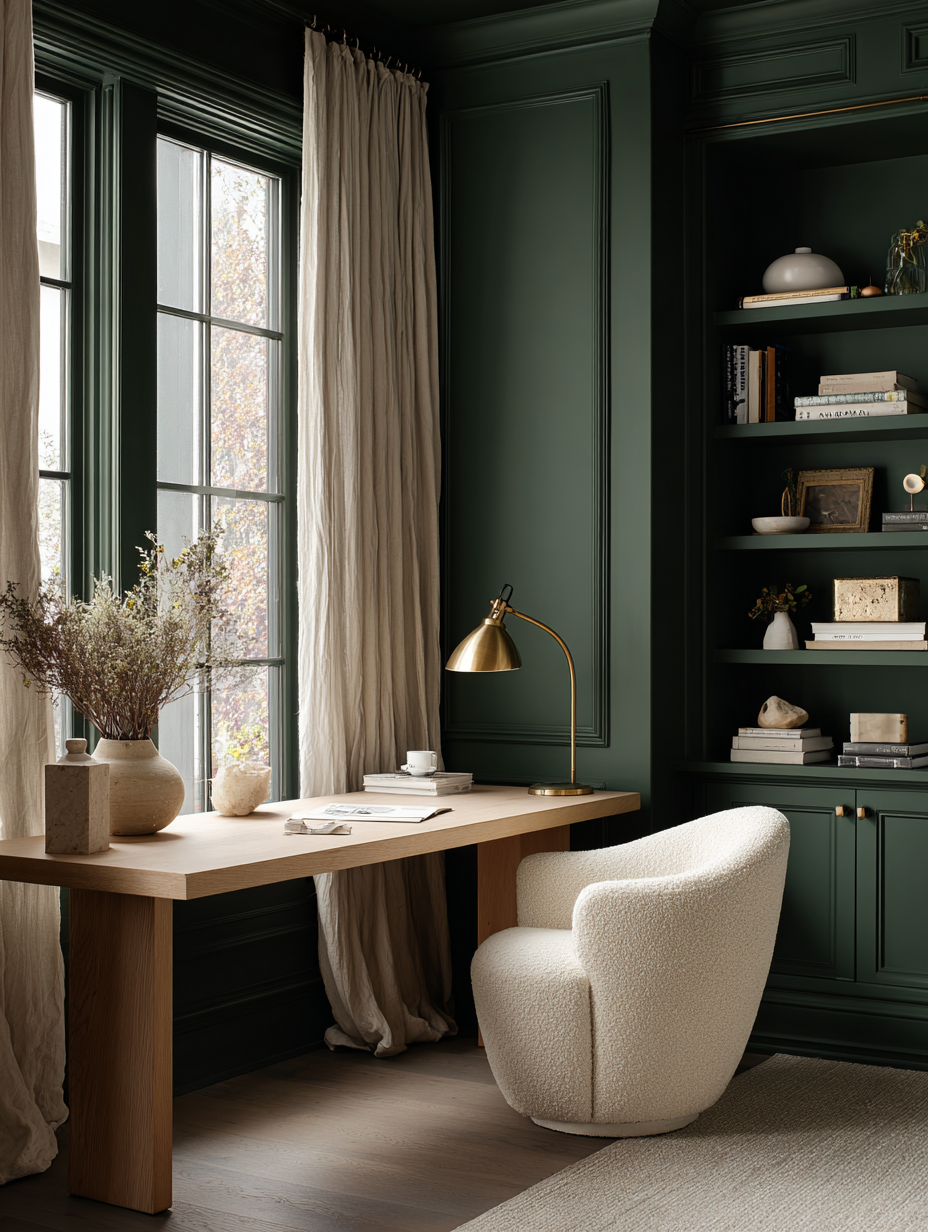
Color Drench in Deep Green (cozy + expensive)
Color drenching in green works especially well in offices, libraries, and dining rooms. It gives that “wrapped in velvet” feeling without being overly formal.

🌿 Forest Green Color Drench
| Brand | Swatch |
|---|---|
| Sherwin-Williams | Pewter Green SW 6208 |
| Benjamin Moore | Backwoods 984 |
| Farrow & Ball | Green Smoke No. 47 |
Best for:
- rooms with medium to low natural light
- spaces with warm wood floors
- anyone who wants cozy but elevated
Color Drench in Moody Blue (calm, tailored, classic)
Deep blue is a safe moody choice if you want something timeless. It can feel coastal, traditional, or modern depending on your styling.
🧵 Moody Blue Color Drench
| Brand | Swatch |
|---|---|
| Sherwin-Williams | Naval SW 6244 |
| Benjamin Moore | Van Deusen Blue 2063-10 |
| Farrow & Ball | Hague Blue No. 30 |

Best for:
- bedrooms
- dens / TV rooms
- spaces where you want calm without going too dark
Color Drench in Warm Charcoal (modern and clean)
Warm charcoal drenching is unreal in modern homes. It feels sleek, architectural, and makes art pop. It’s also a great choice if you want moody without a “color story.”
⚫ Warm Charcoal Color Drench
| Brand | Swatch |
|---|---|
| Sherwin-Williams | Gauntlet Gray SW 7019 |
| Benjamin Moore | Kendall Charcoal HC-166 |
| Farrow & Ball | Down Pipe 26 |

Best for:
- minimalist interiors
- homes with black window frames
- rooms with lots of texture (bouclé, linen, plaster)
Color Drench in Chocolate Brown (the new neutral)
Brown is coming back hard, and color drenching is the way to do it like a designer. Chocolate tones feel warm, rich, and surprisingly grounding—especially when paired with creamy textiles and soft lighting.
🍫 Chocolate Brown Color Drench
| Brand | Swatch |
|---|---|
| Sherwin-Williams | Sealskin SW 7675 |
| Benjamin Moore | Bittersweet Chocolate 2114-10 |
| Farrow & Ball | Cola 9918 |

Best for:
- rooms with warm bulbs and lots of texture
- organic modern or Mediterranean-inspired spaces
- anyone who finds gray too cold
How to Choose the Right Moody Paint (So You Don’t Regret It)
1) Check your light direction
- North-facing rooms: can make colors look cooler and flatter—choose moody shades with warmth or olive undertones.
- South-facing rooms: can handle deeper, cooler shades because there’s plenty of light.
- East-facing rooms: bright early, dim later—test at night.
- West-facing rooms: warm glow in the afternoon—some moody shades can get very intense.
2) Choose the undertone based on your finishes
- Brass / bronze: loves green, brown, warm charcoal
- Chrome / polished nickel: loves blue-black, navy, cooler charcoals
- White oak: loves olive, brown, warm neutrals
- Marble (cool): loves blue-black, charcoal, deep green
- Travertine (warm): loves brown, olive, warm charcoal

3) Don’t judge paint from one swatch
Moody colors change dramatically throughout the day. Tape up large samples (or use peel-and-stick) and view them morning, afternoon, and night. Also, test next to your mirror and vanity if it’s a powder bath—reflective surfaces exaggerate undertones.
Final Styling Tip: The Secret Ingredient Is Lighting
Moody paint needs the right lighting to look intentional instead of gloomy. Use warm bulbs (think soft, golden light), add at least one layered light source (sconce, lamp, or picture light), and bring in texture: linen, stone, aged metals, vintage wood. That’s what takes moody from “dark” to designer.
If you’ve been wanting to try moody paint but you’re nervous, start with a powder bath. It’s the perfect place to be bold—and once you see how sophisticated it looks, you’ll never want to go back.
