
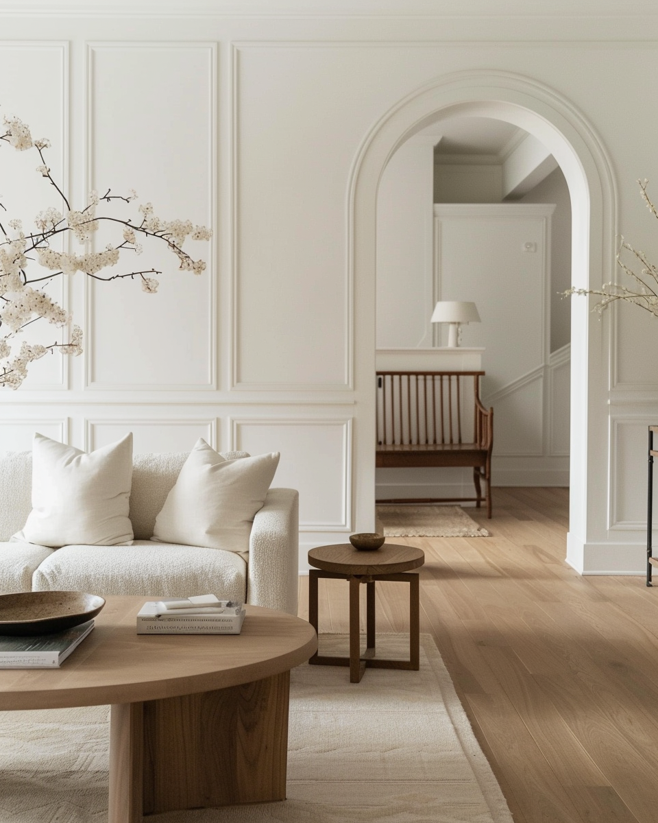
White paint never goes out of style — but in 2026, designers are moving away from stark, cool whites toward warmer, more neutral whites that feel calm, elevated, and timeless. Whether you’re updating kitchen cabinets, living room walls, or trim, the right white can completely transform your space
In this guide, we break down the best Sherwin-Williams whites for every application — with a focus on hues that feel warm, soft, and sophisticated. We’ll also share designer tips for choosing whites that look great in real homes, not just on a swatch.

Why Warm & Neutral Whites Are Trending
- Calmer, cozier interiors: People are moving away from stark minimalism toward warmer, more nurturing spaces.
- Better with natural materials: Warm whites blend beautifully with wood, stone, and brass.
- Easier on the eyes: These whites reflect light without creating glare or stark contrast.

How to Choose the Right White
Before we dive into specific colors, here are a few design fundamentals:
🧠 Know Your Undertone
Warm whites typically have:
- Yellow
- Cream
- Beige
- Soft gray undertones
This prevents whites from feeling icy or cold.

🪟 Test in Real Light
Always test samples on your actual walls — light changes everything.
🛠 Where You’ll Use It Matters
- Walls: Softer, warmer whites
- Trim/doors: Slightly brighter whites for contrast
- Kitchens/cabinets: Whites that read neutral in all lights
The Best Sherwin-Williams Whites for 2026
We’ve grouped these by use case so you can easily pick what fits your space.
1. Best Warm Whites for Walls
1) Sherwin-Williams Alabaster (SW 7008)
- Why designers love it: Soft, creamy, and warm without feeling yellow.
- Where it works: Living rooms, bedrooms, hallways.
- Light note: Warms up in natural light, stays soft in shade.


Great all-around neutral white that reads elegant and intentional.
Related search terms: Alabaster Sherwin Williams, warm white walls, best whites for living room.
2) Sherwin-Williams Creamy (SW 7012)
- Why it’s trending: More ivory than stark white — feels gentle and cozy.
- Where it works: Kitchens, bedrooms, open plan spaces.


A warmer alternative to Alabaster with richer cream notes.
3) Sherwin-Williams Eider White (SW 7014)

- Style: Neutral white with subtle gray undertones
- Why designers like it: Keeps spaces from feeling too warm
- Works well: Modern, minimalist spaces that still want warmth


Tip: Pair with warm wood floors for a grounded look.
2. Best Neutral Whites That Don’t Feel Cold
4) Sherwin-Williams Pure White (SW 7005)

- Undertone: Slightly cool-neutral, very balanced
- Where it shines: Trim, ceilings, modern spaces

A clean neutral that doesn’t clash with warm accents.
5) Sherwin-Williams White Duck (SW 7010)
- Why it’s great: Gives warmth without creaminess
- Ideal for: Historic homes, traditional spaces, kitchens


Looks richer and deeper than the typical “white wall” color.
3. Best Whites for Trim, Doors & Cabinets
6) Sherwin-Williams Pure White (Trim & Cabinets)
- Works double duty as a wall and trim color
- Brightens without harshness
- Great with warmer wall finishes
7) Sherwin-Williams Alabaster (as Cabinet White)
- Creates a subtle, soft contrast
- Warms up cabinetry without becoming too ivory

8) Sherwin-Williams Shoji White (SW 7042)
- Undertone: Soft beige-gray
- Where it works: Traditional or transitional kitchens

How These Whites Look in Different Light
| Color | North Light | South Light | East/West Light |
|---|---|---|---|
| Alabaster | Soft & warm | Slightly creamier | Balanced |
| Creamy | Louder warmth | Cozy & rich | Soft glow |
| Eider White | Cool-neutral | Neutral | Slight warmth |
| Pure White | Bright | Crisp | Neutral |
| White Duck | Warm | Smooth | Balanced |
Designer tip: Warm whites read warmer in north light — test samples on each wall!

Quick Style Pairings
🛋 Warm Modern Living Room
- Wall: Alabaster
- Trim: Pure White
- Accents: wood + brass
🍽 Neutral Kitchen
- Cabinets: Alabaster or White Duck
- Walls: Eider White
- Trim: Pure White
🛏 Cozy Bedroom
- Walls: Creamy
- Trim: Pure White
Mistakes to Avoid With White Paint
- ❌ Choosing whites that are too cool for warm wood tones
- ❌ Ignoring lighting conditions before buying
- ❌ Painting trim and walls in the same white with no contrast

How to Test These Colors at Home
- Paint 3 large swatches on walls
- View at morning, noon, night
- Take photos in daylight
- Walk away, come back later
This is the #1 reason white paint looks “wrong” — it’s never tested in real light.

Final Thoughts (2026 Trends)
Warm and neutral whites are dominating:
- They make spaces feel intentional and lived-in
- They work with both traditional and modern interiors
- They photograph beautifully for Pinterest
- They rank well on Google because people search for them
If you’re updating a room this year, start with one of these Sherwin-Williams whites. They’re designer-approved and future-proof.
